Grimmetal
Well-Known Member
How does everyone feel about our current court designs?
I think it's fairly common knowledge that City is coming back.
How about our 'regular' court? I personally feel it's pretty bland.. but rumor has it changes are coming to that floor next season.
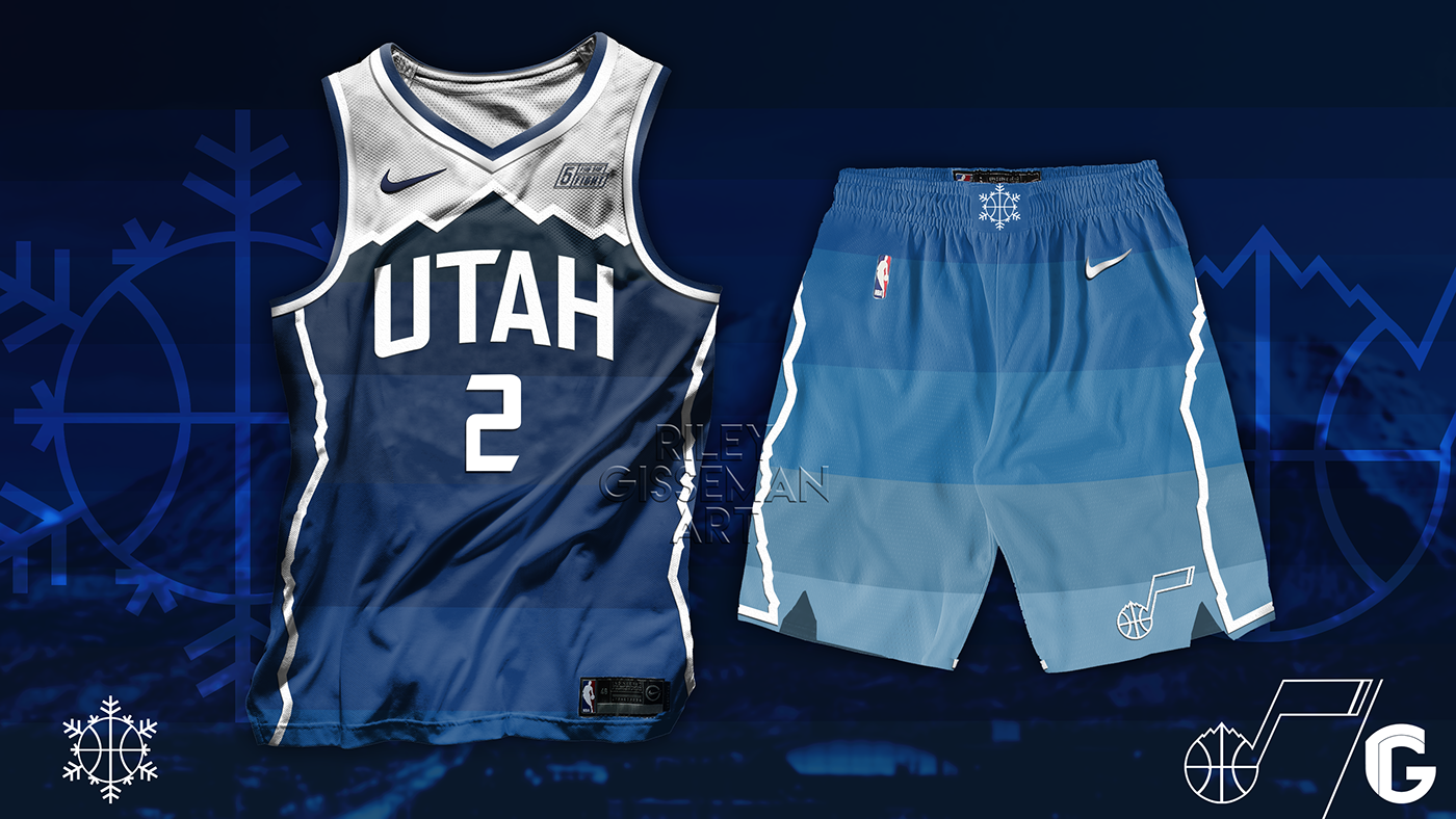
There were rumors of a third court to possibly go with the rumored purple jerseys as well. So, what's your favorite? Are there fan-made designs that you love? Of course, this discussion goes hand-in-hand with uniform talk, but I'd like to focus on just the floor as much as possible.
Regular Old Blue:

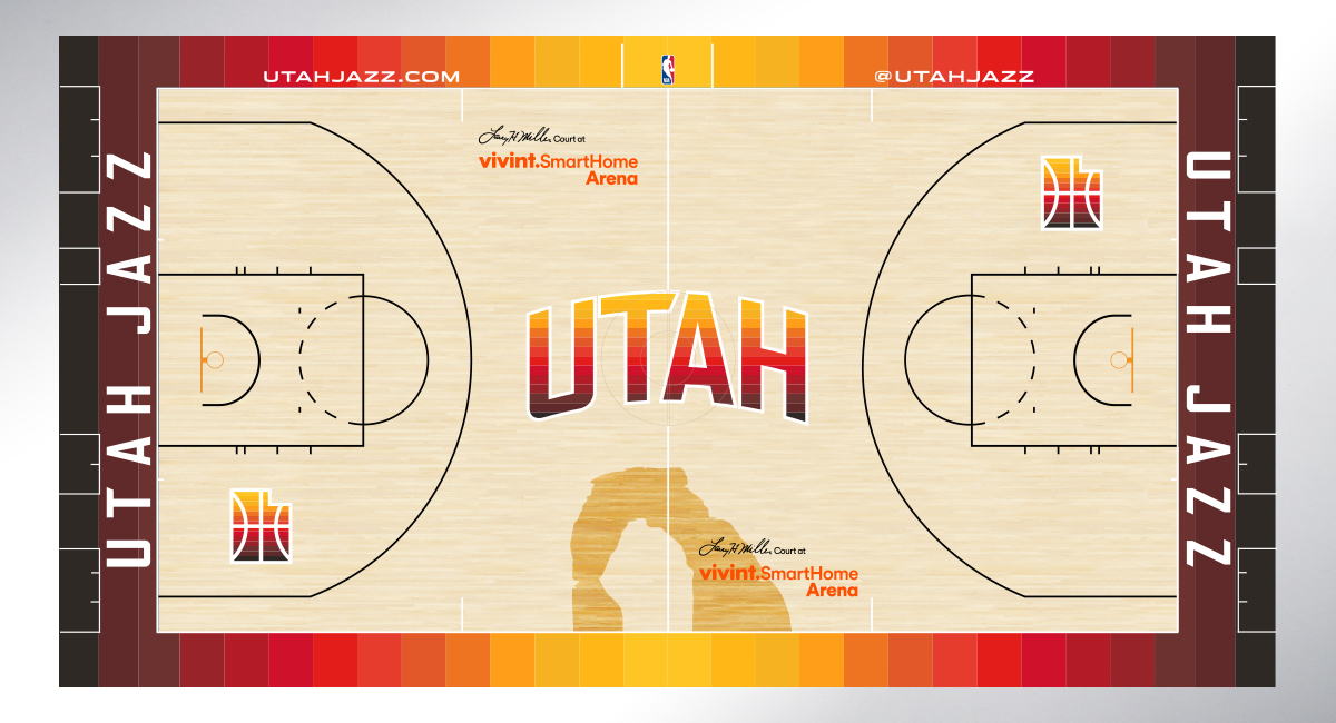
City Court:
I think it's fairly common knowledge that City is coming back.
How about our 'regular' court? I personally feel it's pretty bland.. but rumor has it changes are coming to that floor next season.
There were rumors of a third court to possibly go with the rumored purple jerseys as well. So, what's your favorite? Are there fan-made designs that you love? Of course, this discussion goes hand-in-hand with uniform talk, but I'd like to focus on just the floor as much as possible.
Regular Old Blue:
City Court: