You are using an out of date browser. It may not display this or other websites correctly.
You should upgrade or use an alternative browser.
You should upgrade or use an alternative browser.
Classic note with Utah or +mountain?
- Thread starter ♪alt13
- Start date
I'm actually pretty surprised there was only 5 votes for + mountain.
I prefer just the note but I'd be ok with something like what you and Siro have done.
Plus I read "+ mountains" as the mountains instead of the note and voted based on that since the images where blocked on my comp.
fishonjazz
Well-Known Member
Contributor
2018 Award Winner
2019 Award Winner
20-21 Award Winner
2022 Award Winner
2023 Award Winner
2024 Award Winner
2025 Award Winner
Good ideaI like the yellow
would be nice to mimic the white stripe from the ball between the yellow and green bands in the AZZ part
♪alt13
Well-Known Member
It would have been more interesting if you did not include the original note in the vote. I think note + mountains is much better than the current 3D primary logo.
I gotta go I was thinking I might split the image into a bunch of separate ones so that those that only have MS paint can play around with it. It's already in layers so it should only take a couple mins to upload a bunch of img's. I'll be back in an hour or two.
Here is a "blank" (ironically I think it is my favorite yet)

Do you have a higher resolution image? It kind of sucks having so few pixels to work with.
♪alt13
Well-Known Member
Do you have a higher resolution image? It kind of sucks having so few pixels to work with.
I don't but I should be able to add pixels and then scale it larger.
Jamezz
Well-Known Member
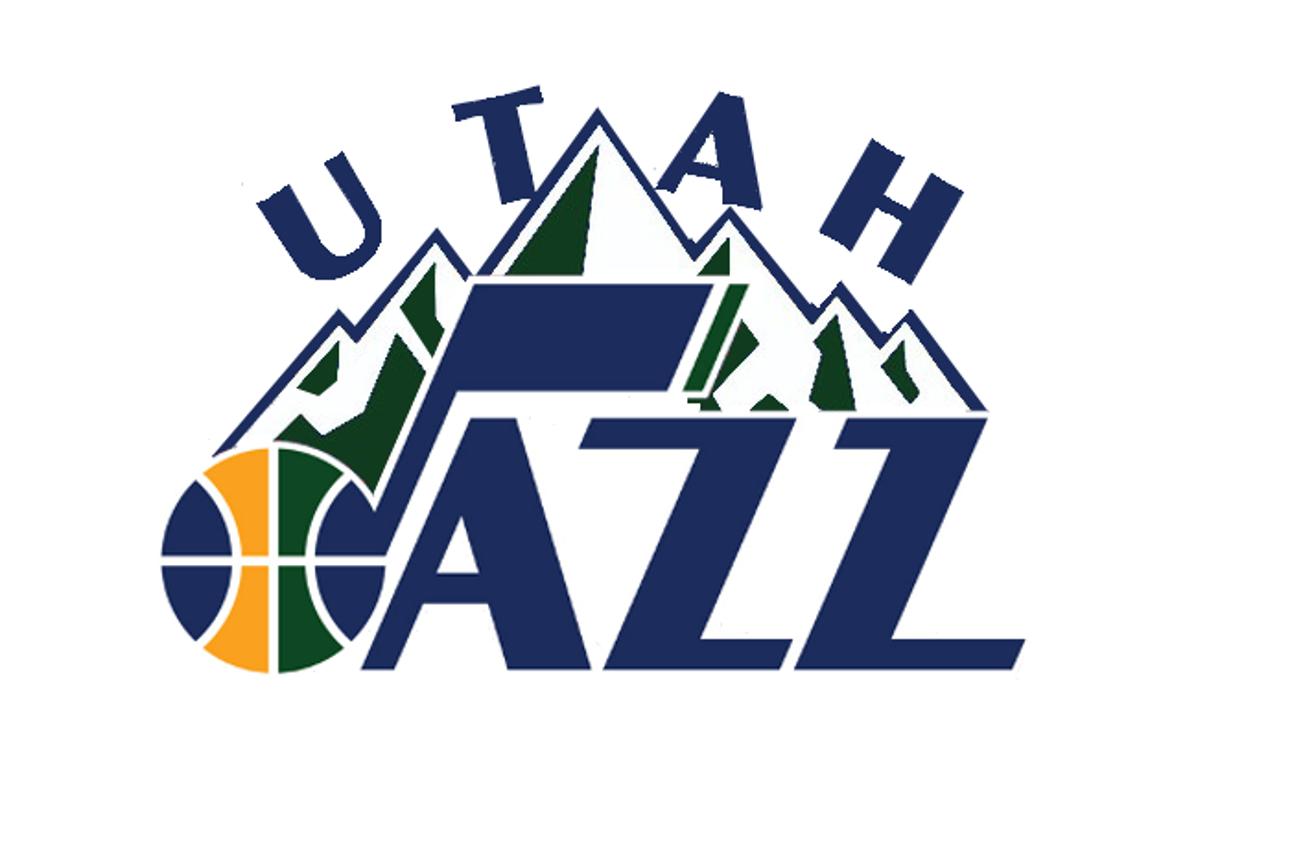
As promised, here's a stylish version of the logo. Looking forward to more suggestions.

I really like where it's going, but something's off with the Utah letters... the placement
Jamezz
Well-Known Member
Need to be a bit higher?
A tiddy bit, so that they not touch the mountains at least
A tiddy bit, so that they not touch the mountains at least
Ya, I'll try that in the next version.
Jamezz
Well-Known Member
I like how the longest, hardest part of the mountain is right in between the T and the A
It's the longest, but why necessarily the hardest?
NAOS
Well-Known Member
It's the longest, but why necessarily the hardest?
I thought you knew everything about the Wasatch??
As promised, here's a stylish version of the logo. Looking forward to more suggestions.

This one is sweet, or at least the Jazz part is.


