What's new

New Uni's Unveiled

Doesn't an apostrophe signify missing letters as well as possession? Unis isn't a word, so just deleting the apostrophe would also be incorrect, I believe.

Aah, I see Catchall argued the same point.

IDK about that, but apostrophe does have other uses besides possession. For instance if you say "There are no i's in that word" you put the apostrophe there because if you type out "is" it will be confusing and look like you are saying the word "is".
 
Technically, the apostrophe is used properly as it signifies the abbreviated version of 'Uniforms.'

For example, if you were shortening the word 'International' you might abbreviate it as Int'l, whereby the apostrophe signifies removal of the middle letters. This is a similar case, imo. Not common, but not unreasonable.
Or...if the OP wasn't so lazy, could've just typed in an extra 4 letters (maybe an additional 1 second of typing?) to spell out the entire word?
 
I like Nike's version, but mostly because I thought that the Jazz hit a home run with these uni's when they rebranded back to the music note. The solid stripe around the neck looks alright but my favorite part is what's not there: So glad to see the "Utah" tramp stamp is no longer on the back of our shorts.

Overall, it's a "meh" for me. Not because Nike didn't do good, but because we knew the changes to our 2 main kits were gonna be minimal. I'm saving my anticipation/hopefulness for what we'll see with the next 2 uni's. If I'm not mistaken, we've been promised that one will be released before the season opener and the other to follow in November/December, have we not?
 
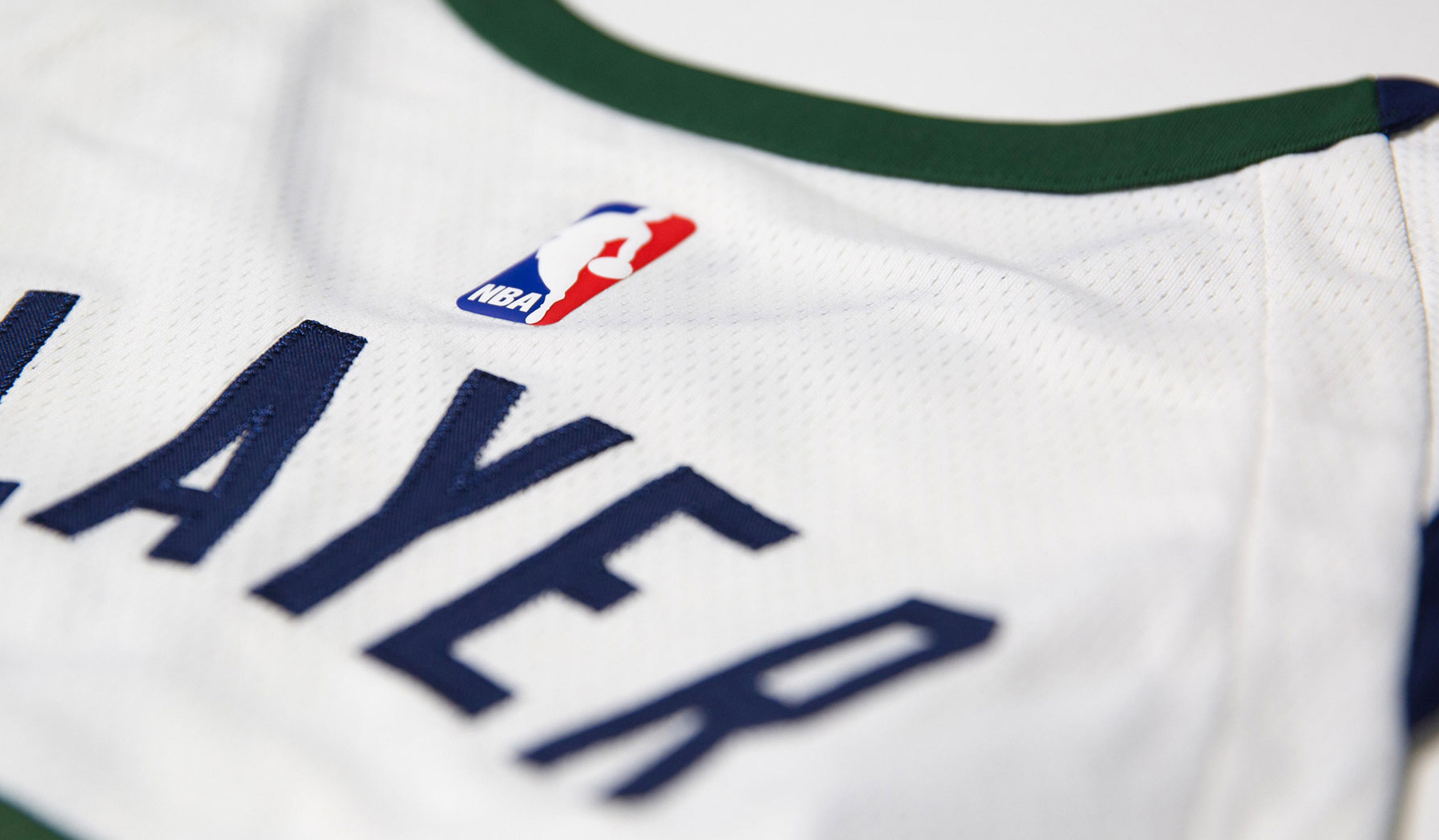
So the collar has two-tone piping? On the white jersey, it is navy on the front and green on the back.
Screen_Shot_2017_08_09_at_10.06.48_AM.png


On the navy jersey it looks like it is gold on the front and white on the back.

Screen_Shot_2017_08_09_at_10.12.11_AM.png
 
Good point about wearing it untucked. I'd just buy Jazz t-shirts. Too poor to spend $90 on a jersey. Also don't see the attraction of wearing some guy's name on my back. Realize that's just me, though. Would have been funny had they used #20 in the pic.

I love wearing my Gobert pride jersey to the game. Feels powerful and whatnot.
 
It's retarded to ignore amazing designs people release every year and manufacture these craps like they're something new. Is being boring a necessity?
 
So the collar has two-tone piping? On the white jersey, it is navy on the front and green on the back.

Screen_Shot_2017_08_09_at_10.06.48_AM.png


On the navy jersey it looks like it is gold on the front and white on the back.

Screen_Shot_2017_08_09_at_10.12.11_AM.png

Very good observation. Interested to see how the yellow/white collar looks in real life.
 
I still like the designs, my gripe is if you put a 'Pacers' logo on the front of the 'Blue' jersey and it could easily be the Pacers jersey.


The colours and designs are just a bit too similar without the different logos.


pacers_g9blhx4uutqq1drpfedj1kytz.jpg


Having said that, I still like ours a tonne better than theirs though. Not a fan of the new 'Indiana Pacers' written around the numbers like that.
 
Yea, Indiana's are solid.

Anyone seen Minnesota's yet? Those are pretty bad. I like they went with green as a primary color though, as green is a highly underutilized basketball color, but damn are they bad from a design standpoint.
 
Yea, Indiana's are solid.

Anyone seen Minnesota's yet? Those are pretty bad. I like they went with green as a primary color though, as green is a highly underutilized basketball color, but damn are they bad from a design standpoint.

Is there a single website that shows all the new updated designs as they're introduced?
 
They look nice. One problem, though, is that if you wear one untucked it seems like it'll look a bit goofy with the way the stripes end pretty high up. Perhaps that works better for the uniform as a whole, jersey with shorts, but as for fans wearing them to games, will they look a bit goofy? And the number seems pretty close to the Jazz logo as well.

Overall I like them fine. At the least, they didn't do a design that actively bothers me. (Yet.)

99% of Utah dudes wearing the jersey around town are going to look goofy, regardless.
 
Yea, Indiana's are solid.

Anyone seen Minnesota's yet? Those are pretty bad. I like they went with green as a primary color though, as green is a highly underutilized basketball color, but damn are they bad from a design standpoint.

I'm disappointed that there isn't one of these. Green should be the primary, drop the blue and bring back purple as an alternate.

32b8c52d7b6f2921806ee8e4e5b837ca--rudy-gobert-jordan-shoes.jpg


IMG_6385_20(898x1280)_20(3)_original.jpg
 
That dude i's shiny.
 
I give it a big ol' meh. I actually hated the blue jerseys we had, and that tend continues with Nike. Blue is so generic to me (white as well but duh). So our 2 main jerseys feel uber generic which doesn't inspire me to drop a c-note to get one.
 
Has anybody else seen the Minnesota uni's? I'm just wondering if I need to get my eyes checked. So many people hate them and I absolutely love them. Actually, I think they're the best Nike uni's I've seen so far.
 
Back
Top