
I'm sure they will look better in person.
You are using an out of date browser. It may not display this or other websites correctly.
You should upgrade or use an alternative browser.
You should upgrade or use an alternative browser.
New Nike Uniforms: How Bad Are They Going To Look?
- Thread starter Magic Spray
- Start date
Handlogten's Heros
Well-Known Member
2019 Award Winner
20-21 Award Winner
2022 Award Winner
2023 Award Winner
2024 Award Winner
2025 Award Winner
2025 Prediction Contest Winner
I like that logo/number scheme. Colors are fine but for us light-skinned guys it may not be ideal.
Cappy_Smurf
Well-Known Member
Whoever decided on yellow jerseys needs to be canned immediately.
Barforahma
Barforahma
Jack Strop
Well-Known Member

According to Conrad Burry, "wordmark+number is 100% accurate, guesstimation for sides and collar/arm trim"
Here's some other renderings he's done.
http://news.sportslogos.net/2017/09/06/nike-nba-mindset-and-community-uniforms-update/
Why is everyone getting worked up? This is just his fabrication. The only thing authentic is the logo. We have no idea if that will be the design, the shade of yellow, the fonts or the placement of the note. Maybe the jersey even uses "Jazz" or "Utah" instead of the note. I think the only guarantees are the Swoosh and the patch.
I don't know why but the Jazz new uniforms looks so similar to Indiana Pacers ones.
If anything I would say this new one reminds me of the Spurs alternates form last year.

If anything I would say this new one reminds me of the Spurs alternates form last year.
I meant the colors.
Anyway I don't like any of the three new uniforms...let's hope at least the orange one will be better!
framer
Well-Known Member
I don't know why but the Jazz new uniforms looks so similar to Indiana Pacers ones.
Because the guy literally used the Indiana Pacers jersey to construct a possible Jazz jersey. This is in no way official other than the Jazz Jersey is rumored to be some kind of yellow and that the Jazz own certain registered trademarks.
This is in no way official other than the Jazz Jersey is rumored to be some kind of yellow and that the Jazz own certain registered trademarks.
Ah ok, I just read that the colors are a guesstimation! Better because I don't like this kind of yellow.
Magic Spray
Well-Known Member
As OP, I titled this thread "How Bad Are They Going To Look?" because I just KNEW we were going to get bent over a barrel on this.
Well well well. Look at this ********.
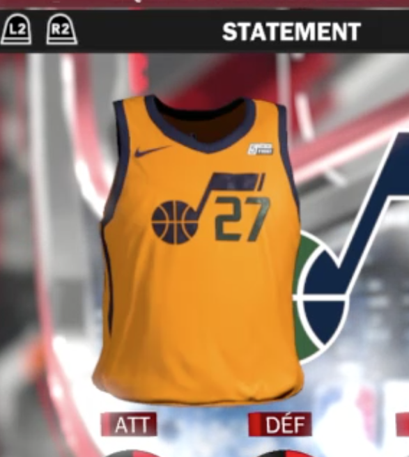
This indeed is the "statement" jersey.
That statement being, **** you jazz fans, here's some ****-*** clip art our art director's 6-year-old son made on his leapfrog and we presented to Steve Starks as a goddamn joke, but he thought it looked awesome. Actually he straight creamed his jeans over this stupid design. So guess what? You all get to look at a piss-colored ****ty jersey 25% of the time, because you know there are going to be mandatory minimums for how often a team has to wear our stupid logo-riddled STD-inducing jerseys now.
THIS is how bad they are going to look.
Source: https://twitter.com/conradburry/status/908046576190357504
Well well well. Look at this ********.
This indeed is the "statement" jersey.
That statement being, **** you jazz fans, here's some ****-*** clip art our art director's 6-year-old son made on his leapfrog and we presented to Steve Starks as a goddamn joke, but he thought it looked awesome. Actually he straight creamed his jeans over this stupid design. So guess what? You all get to look at a piss-colored ****ty jersey 25% of the time, because you know there are going to be mandatory minimums for how often a team has to wear our stupid logo-riddled STD-inducing jerseys now.
THIS is how bad they are going to look.
Source: https://twitter.com/conradburry/status/908046576190357504
Look pretty piss poor and bland. The 4th ones better be good.
Sent from my A0001 using JazzFanz mobile app
Sent from my A0001 using JazzFanz mobile app
Looks fine to me.
Cappy_Smurf
Well-Known Member

RandyForRubio
Well-Known Member
Those are awful.
enchilada_style
Well-Known Member
I'm going to wait to see what our record is in the yellow jersey before I officially hate them.
Zombie
Well-Known Member
I think they're fine. I also think it's really weird to get riled up over how jerseys look.
Sent from my SM-G935V using JazzFanz mobile app
Sent from my SM-G935V using JazzFanz mobile app