You are using an out of date browser. It may not display this or other websites correctly.
You should upgrade or use an alternative browser.
You should upgrade or use an alternative browser.
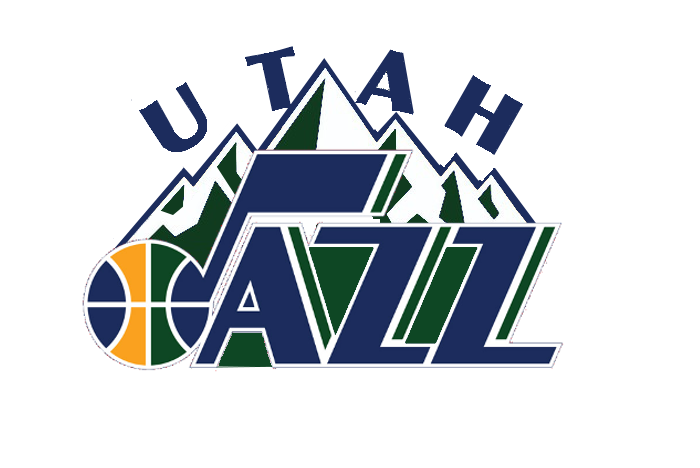
Classic note with Utah or +mountain?
- Thread starter ♪alt13
- Start date
Jamezz
Well-Known Member
I'd like the 3rd one without the exterior circle, and draw the mountains so that you can have Utah written right above Jazz like in the 1st logo. I prefer the more dynamic feeling you get with the word 'Jazz' in the 3rd logo. Hard rep to whoever photoshops what I'm seeing here.
♪alt13
Well-Known Member
I vote note. I never really liked the mountain design. Too busy.
classic note. All day.
I get that but what would be your second choice?
Jamezz
Well-Known Member
I vote note. I never really liked the mountain design. Too busy.
classic note. All day.
I see what you guys are saying but let go of nostalgia and add the 3D. This is the Gobert era!
Jamezz
Well-Known Member
Note and it isn't even close. Nuggets already have a mountian range and it fells like a copy off of them tbh.
They have a mountian range, we have the best m*** f*** MOUNTAIN range in the world.
♪alt13
Well-Known Member
Note and it isn't even close. Nuggets already have a mountian range and it fells like a copy off of them tbh.
It's cool. I heard they are changing their logo to something a little more appropriate.
Denver
image removedNUGGETS
Last edited by a moderator:
NAOS
Well-Known Member
They have a mountian range, we have the best m*** f*** MOUNTAIN range in the world.
in what sense?
I mean, I like the Wasatch (and I'm assuming you're talking about the Wasatch), but what makes them the best?
Jamezz
Well-Known Member
in what sense?
I mean, I like the Wasatch (and I'm assuming you're talking about the Wasatch), but what makes them the best?
I was just being a proud homer, don't be so over-analytical about everything, geeeeeez
It's the note, should always have been the note, and should always be the note.
You don't **** some of the best branding in the NBA.
You don't **** some of the best branding in the NBA.
classic note and its not even close.
fishonjazz
Well-Known Member
Contributor
2018 Award Winner
2019 Award Winner
20-21 Award Winner
2022 Award Winner
2023 Award Winner
2024 Award Winner
2025 Award Winner
I like both the the first two.
Main thing is that the note is better than mtns so the note has to be prevalent.
I do like the note mtns combo though.
Main thing is that the note is better than mtns so the note has to be prevalent.
I do like the note mtns combo though.
RandyForRubio
Well-Known Member
The note is just so good. Simple, classic, looks good.
Joe Bagadonuts
Well-Known Member
I love the note with the mountains. It captures both the tradition and what is special about the location to me. The fact that Denver has some mountains in their logo is not a reason that Utah shouldn't. The Wasatch Front is a far more dramatic backdrop to a city than the Frontrange is so if any logo should be without mountains it ought to be theirs.


