fishonjazz
Well-Known Member
Contributor
2018 Award Winner
2019 Award Winner
20-21 Award Winner
2022 Award Winner
2023 Award Winner
2024 Award Winner
2025 Award Winner
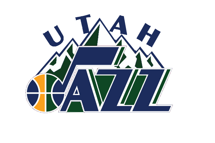
Isn't that the exact same as the one in the OP?The note with the mountains is better than the current logo. But it's still a bit busy. I made some quick adjustments to unbusify it.

(btw, I'm not trying to upset you. I know you are on your period and all so take it easy please)
")