
Didn't think the Clippers logo could have gotten any worse, but I think it just did. Just so robotic and lifeless.
What'd you guys think?

What'd you guys think?


I honestly think I could have done better and that's not an exaggeration.This is quite possibly some of the least inspired design work I've ever viewed. It looks like it was created with PrintShop.
This is quite possibly some of the least inspired design work I've ever viewed. It looks like it was created with PrintShop.
Dude, give Trout a break. It was his first professional go at a logo with paint. Cut him some slack.

Good call lolLOL ...
- The black Alternate uniform looks like the NBA Summer League Logo
- The Primary logo looks like EA Sport NBA LIVE 2006 Logo
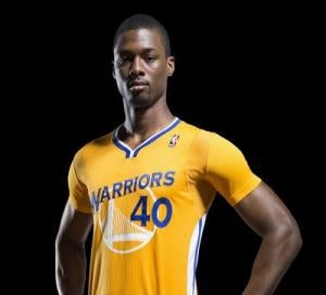
You are right that you can't see the number very well and that is obviously important but I do like the picture on the front of their jerseys stillI agree that it's poor, but every one of these are better than GSW. You can hardly even see the # on the front of those jerseys:
Seems like there should be some NBA standard for font size and contrast on the #. In the end, it's one of the only elements of the jersey design that really matters.
Yeah the revamped GSW logo/design is one of the better designs in the NBA at the moment imo.You are right that you can't see the number very well and that is obviously important but I do like the picture on the front of their jerseys still
I think the bridge is a good idea but I think it could be executed better. This version is much better than their white or blue primary uniforms.You are right that you can't see the number very well and that is obviously important but I do like the picture on the front of their jerseys still
Ya that works tooI think the bridge is a good idea but I think it could be executed better. This version is much better than their white or blue primary uniforms.