
You are using an out of date browser. It may not display this or other websites correctly.
You should upgrade or use an alternative browser.
You should upgrade or use an alternative browser.
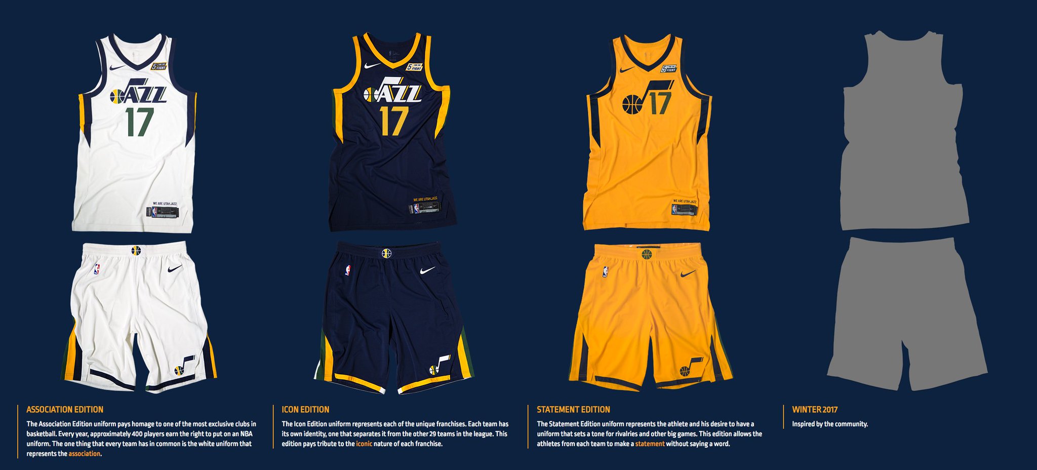
New Nike Uniforms: How Bad Are They Going To Look?
- Thread starter Magic Spray
- Start date

Magic Spray
Well-Known Member
Joe Johnson is not feeling these.
Chargers Jazz Angels
Well-Known Member
i like em
LifeOnaPlate
Well-Known Member
The JJ image makes them look slightly better.
The official reveal makes them look a bit better.
Overall rating is now at a 6/10
Overall rating is now at a 6/10
[tweet]908867326698651649[/tweet]
Looks much better in real life.
The numbers is too close to the J logo though IMO.
Looks much better in real life.
The numbers is too close to the J logo though IMO.
[tweet]908867326698651649[/tweet]
Looks much better in real life.
The numbers is too close to the J logo though IMO.
OK, I'm officially thinking about getting 1. Looks pretty cool.
The official reveal makes them look a bit better.
Yeah, they'll probably grow on people a bit.
Here's Hood representing us at the launch..
[tweet]908866073704808449[/tweet]
[tweet]908866073704808449[/tweet]
[tweet]908867326698651649[/tweet] The numbers is too close to the J logo though IMO.
Yep. I'm the last person you should ever trust on design matters, but I like the sides & back of the uni much better than the front.
Yep. I'm the last person you should ever trust on design matters, but I like the sides & back of the uni much better than the front.
At first I thought the top is too 'busy' with the collar and the sponsor and the 'J' note and the numbers all at the top half of the jersey. But I guess they wouldn't stand out as much if they were at the mid section area?
Overall I'll probably end up buying 1, looks pretty trendy. One of the trendiest Jazz jersey I've seen for a while.
[TWEET]908869358255988737[/TWEET]
I kind of like the look on Mizuho Nishio's rendition of Rodney Hood better, without the note and number crammed into the top half of the jersey:
https://twitter.com/rodneyhood/status/908869358255988737
At first I thought the top is too 'busy' with the collar and the sponsor and the 'J' note and the numbers all at the top half of the jersey. But I guess they wouldn't stand out as much if they were at the mid section area?
I kind of like the look on Mizuho Nishio's rendition of Rodney Hood better, without the note and number crammed into the top half of the jersey:
https://twitter.com/rodneyhood/status/908869358255988737
Last edited:
[TWEET]908881429194448896[/TWEET]
more from Mizuho:
https://twitter.com/utahjazz/status/908881429194448896
more from Mizuho:
https://twitter.com/utahjazz/status/908881429194448896
Man, the Minnesota one looks REALLY bad in real life.
I probably like the OKC one the most.
Ours looks like it's one of the best actually, top 5 IMO. Nice job.

I probably like the OKC one the most.
Ours looks like it's one of the best actually, top 5 IMO. Nice job.
Finally, there's only 1 chance left for us to get our beloved 'Mountain' logo on a jersey... appropriately this is going to be the one inspired by the Community. We really need to make our voices heard if we're to get our 'Mountain' logo on a jersey this year.
jope
Well-Known Member
Finally, there's only 1 chance left for us to get our beloved 'Mountain' logo on a jersey... appropriately this is going to be the one inspired by the Community. We really need to make our voices heard if we're to get our 'Mountain' logo on a jersey this year.
Would be super stoked to get purple mountains majesty back in rotation