
You are using an out of date browser. It may not display this or other websites correctly.
You should upgrade or use an alternative browser.
You should upgrade or use an alternative browser.
New Nike Uniforms: How Bad Are They Going To Look?
- Thread starter Magic Spray
- Start date
LifeOnaPlate
Well-Known Member
none of this is official until tomorrow, bro. So, be cool... it could all turn out to be the purple mountain jerseys. Based on the quotes from the pres, the whole organization seems to love those old purple mountain jerseys just like you.
Lol at anyone thinking this isn't already set in stone
Archie Moses
Well-Known Member
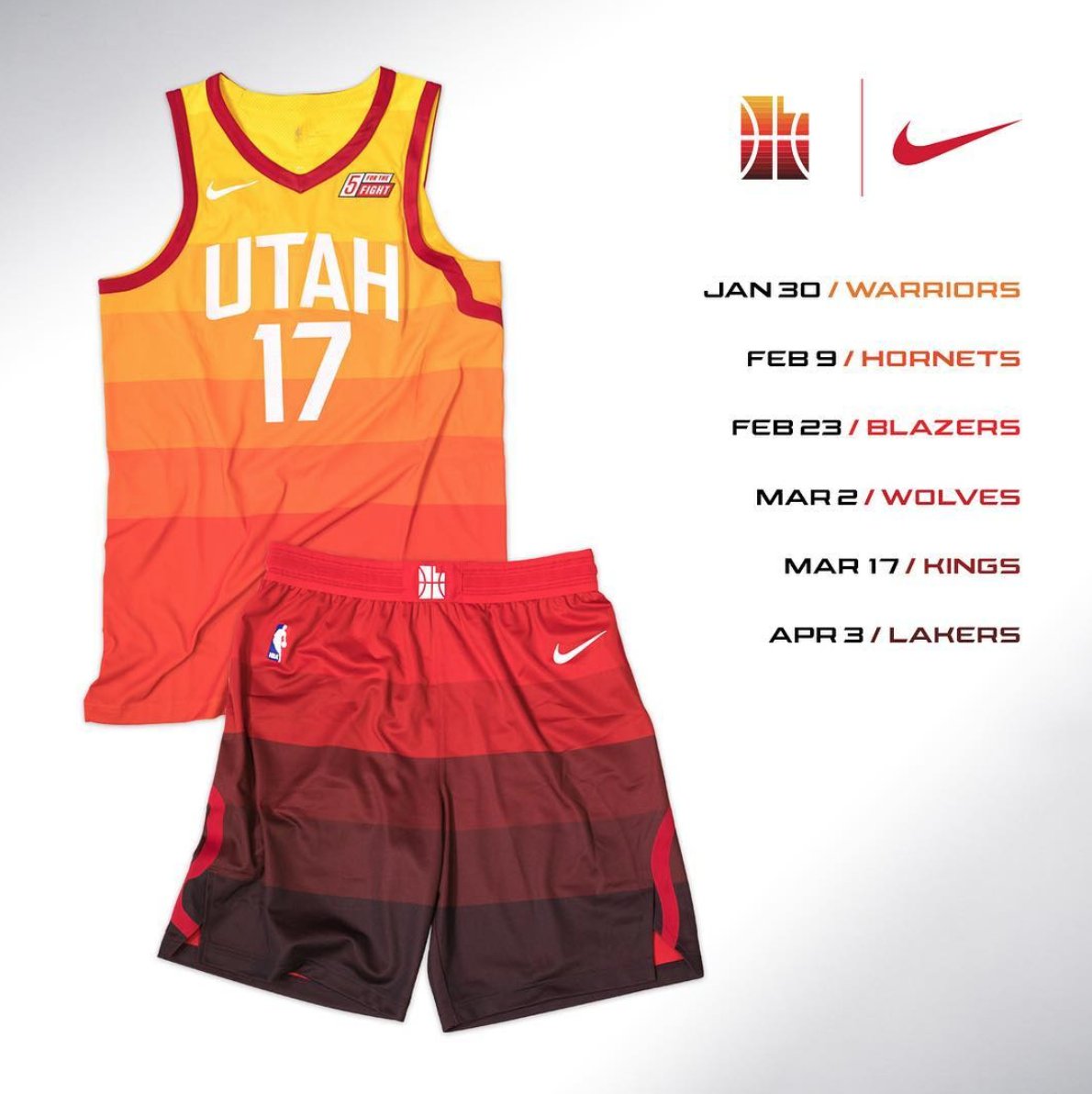
They literally used the precise gradient change of colors in the shorts and onto the Jerseys.Anyone else noticed that the shorts, after the first 2 strip of colours the tone changed significantly from the 3rd, 4th, 5th shades of colour?
Anyone else wonder why that is? Could they not have made the gradient change more gradual?
Maybe the 2nd strip could have been a bit darker and the 3rd strip slightly darker to make the gradient more gradual?
Archie Moses
Well-Known Member
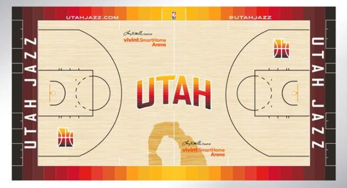
Utah Archies * clap clap clap clap clap*The new court though is FANTASTIC. Verging on AMAZING.
NAOS
Well-Known Member
u sooo rude!!!1!!Lol at anyone thinking this isn't already set in stone
NAOS
Well-Known Member
rude!Lol at anyone thinking this isn't already set in stone
So we came 21st overall according to the Yahoo! ranking.
I think that's about right. It was a bold choice but I'm still not sure how it'll look on the court. I get what they're trying to do and represent the state and all but it looks too 'rainbowy' to be for a basketball jersey. Also has that try hard feel and not effortless.
https://sports.yahoo.com/nike-city-uniforms-ranked-worst-best-183058593.html
spycam1
Well-Known Member
Most of those are boring AF.So we came 21st overall according to the Yahoo! ranking.
I think that's about right. It was a bold choice but I'm still not sure how it'll look on the court. I get what they're trying to do and represent the state and all but it looks too 'rainbowy' to be for a basketball jersey. Also has that try hard feel and not effortless.
https://sports.yahoo.com/nike-city-uniforms-ranked-worst-best-183058593.html
Sent from my SM-G930P using JazzFanz mobile app
I like most of the jerseys. I definitely prefer the ones like Utah who went bold and tried to do something unique, even if they came up short.
I like most of the jerseys. I definitely prefer the ones like Utah who went bold and tried to do something unique, even if they came up short.
True. I can't imagine being a fan of Detroit, or Celtics, or the Suns, or the Nets ... those jerseys are just soooooo plain and timid and boring to me. At least we got colour and style.
Here's some more commentary.
https://www.theringer.com/nba/2017/12/27/16823246/nike-city-uniforms-jersey
The consensus seems to be that they like the bold choice of theme and colour of the Jazz jersey, but just not sure about the execution of it.
https://www.theringer.com/nba/2017/12/27/16823246/nike-city-uniforms-jersey
The consensus seems to be that they like the bold choice of theme and colour of the Jazz jersey, but just not sure about the execution of it.
Magic Spray
Well-Known Member
This is like the day after the super bowl when everyone is suddenly Don ****ing Draper when it comes to ads.Here's some more commentary.
https://www.theringer.com/nba/2017/12/27/16823246/nike-city-uniforms-jersey
The consensus seems to be that they like the bold choice of theme and colour of the Jazz jersey, but just not sure about the execution of it.
oh what's that? you're not an advertising executive? But I thought you were just telling me why the Geico ads were so poorly done.
If people were legit designers they would be designers, not internet commenters.
This is like the day after the super bowl when everyone is suddenly Don ****ing Draper when it comes to ads.
oh what's that? you're not an advertising executive? But I thought you were just telling me why the Geico ads were so poorly done.
If people were legit designers they would be designers, not internet commenters.
I love and miss Mad Men. Will watch the whole thing again 1 day when I've got lots of free time. Thanks for the reference.
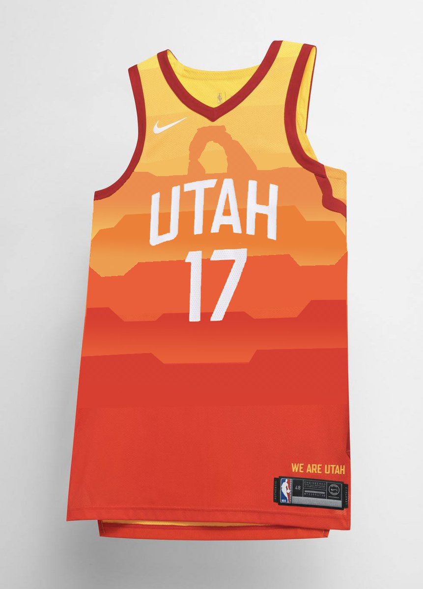
Someone made this mock on Twitter... looks way better than the actual one IMO.
fishonjazz
Well-Known Member
Contributor
2018 Award Winner
2019 Award Winner
20-21 Award Winner
2022 Award Winner
2023 Award Winner
2024 Award Winner
2025 Award Winner
Someone made this mock on Twitter... looks way better than the actual one IMO.
Agreed.
NAOS
Well-Known Member
I guess these new ones are official now, right?Someone made this mock on Twitter... looks way better than the actual one IMO.
I guess these new ones are official now, right?
You're trying wayyy too hard to be cool man. Chill.
NAOS
Well-Known Member
that looks dumb afSomeone made this mock on Twitter... looks way better than the actual one IMO.
NAOS
Well-Known Member
well it's 12/27/17.. I think that means these are officially official.You're trying wayyy too hard to be cool man. Chill.