What's new

Rebrand?

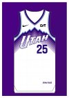
Big big improvement over the current jerseys, which are the worse in the league, but HUGE swing and a miss to not have the note on a purple jersey. Never been a big fan of the mountain jerseys. There are so many good options out there and the Jazz keep missing. The black ones would be great if they took the mountain off but the purple trim and the note are a big upgrade.
 
Big big improvement over the current jerseys, which are the worse in the league, but HUGE swing and a miss to not have the note on a purple jersey. Never been a big fan of the mountain jerseys. There are so many good options out there and the Jazz keep missing. The black ones would be great if they took the mountain off but the purple trim and the note are a big upgrade.
the whole appeal of the mountain jersey is the irony of having the word "Jazz" over mountains and that it looks sick despite it being the dumbest **** ever.
 
Big big improvement over the current jerseys, which are the worse in the league, but HUGE swing and a miss to not have the note on a purple jersey. Never been a big fan of the mountain jerseys. There are so many good options out there and the Jazz keep missing. The black ones would be great if they took the mountain off but the purple trim and the note are a big upgrade.
this is exactly how I feel - the purple and black needed a note-only jersey option. But they are significantly better than before
 
They look okay to me but I would rather have just stuck with the ones from before the yellow/black/white rebrand.
 
Ryan Smith is weird with this branding ****.

Definitely don't expect Utah HC to be a smooth seamless thing.
I'm sure its a Nike thing not a Ryan thing.
 
Screen grab those those interested.

I do like the white uniforms. The black is boring, but black always looks at least OK (just despise how slapped on the note looks). I just dont understand the need for the two purples when they are nearly identical. I guess one of them is temporary design that will be replaced by another unnecessary design every 2 years?
I totally agree that the two purple are totally redundant. If you are doing two purple it should be the retro one from last year. Not a fan of the one Lauri is wearing.
 
Back
Top