What's new

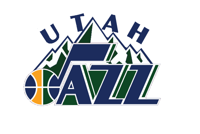
Utah Jazz to make logo changes this offseason or next. Likely looking to make the Jazz note logo pri

I think the mountain jerseys were worse, but it could have just been the color scheme. I do like the throwbacks the Jazz had during this time. The green and yellow jerseys were by far the best throwbacks ever.... Until the jazz throwback the stars jersey!

The powder blue color is gorgeous. The logo is a little meh, but far from horrible or the "worst ever".
 
I like the note logo but I don't really like the placement of "Utah". I think the note looks better without it. I hope they leave it off the Jersey's. I also like the mountain logo but the "JAZZ" script is just awful. Here is a mix of the two I did.
CK75ofNUMAAEDV5.png

CK75ohsUYAAU4Ih.png
 

Attachments

  • Jazzprimarywhite.jpg
    Jazzprimarywhite.jpg
    15.4 KB · Views: 3
  • jazzprimary.jpg
    jazzprimary.jpg
    10.5 KB · Views: 3
I like the note logo but I don't really like the placement of "Utah". I think the note looks better without it. I hope they leave it off the Jersey's. I also like the mountain logo but the "JAZZ" script is just awful. Here is a mix of the two I did.
CK75ofNUMAAEDV5.png

CK75ohsUYAAU4Ih.png
I'm honestly surprised at how much I like this. Excellent work!
 
I like the note logo but I don't really like the placement of "Utah". I think the note looks better without it. I hope they leave it off the Jersey's. I also like the mountain logo but the "JAZZ" script is just awful. Here is a mix of the two I did.
CK75ofNUMAAEDV5.png

CK75ohsUYAAU4Ih.png
****ing nailed it!
 
Back
Top