
You are using an out of date browser. It may not display this or other websites correctly.
You should upgrade or use an alternative browser.
You should upgrade or use an alternative browser.
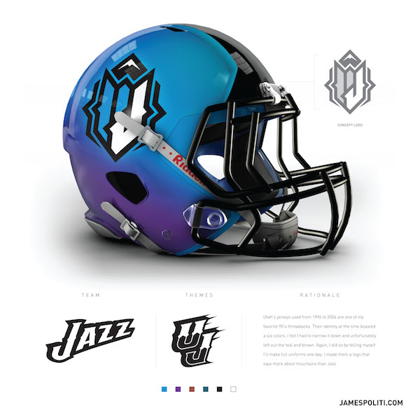
What do you think of this Jazz logo?
- Thread starter cooldude32
- Start date
Horrendous
cooldude32
Well-Known Member
I wouldn't mind seeing that logo as alternate logo, maybe on the court.
I guess it's more defensible since this was designed 2 years ago before the Jazz made the commitment to focusing the Jazz note.
I like the color fade but mostly because it reminds me of those color changing hyper color shirts in the 90s. I loved mine. I think the logo could be fixed up a bit to look cool.
Sent from my Nexus 5X using JazzFanz mobile app
Sent from my Nexus 5X using JazzFanz mobile app
I just dont get if you aint going to do the "Jazz" theme at least give us some mountains.
LOL .. the mountain top looks like the top of the nuggets logo:

DutchJazzer
Banned
I want the purple mountains of mid 90's BACK!!!!!!!!!!
or as alternate uniforms
RIGHT NOW!
or as alternate uniforms
RIGHT NOW!
BackHander
Active Member
I like it. I am not a huge fan off the note logo. I do like the uniforms though, if that makes sense. It would be interesting to see the uniforms.
I don't really like that logo. I do think the color choices are cool though.
Ya, I feel the same way. Love the colors, but the logo is too blocky and angular to fit the Jazz aesthetics.
416Klawzz
Well-Known Member
Blutarsky12
New Member
What an incredible logo...
For me to poop on
For me to poop on