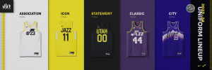
Jazz unveil new Classic Edition uniforms for 2023-24
The Utah Jazz will have new uniforms and a matching Classic Edition court. Both represent the early days of Jazz basketball.
IMO this is the second year in a row the jerseys are just awful.

Live View TechnologiesWhat does LVT stand for?
You know those mobile surveillance towers stores put out in parking lots? That's themWhat does LVT stand for?
Agree about the note, wanna give it a pass because it's just a genuine music note now, which I kind of want to commend. Unfortunately, it simply just does not look good.The note looks derpy. Otherwise way way way better than the black and yellow garbage. Colors are good.
I get that too. But since we had a basketball note for so long it just looks deflated.Agree about the note, wanna give it a pass because it's just a genuine music note now, which I kind of want to commend. Unfortunately, it simply just does not look good.
It's the owner and the childhood dream images in his head. Guarantee you he approves every one of these and that the yellow and black fiasco was completely his idea. He needs to get out of the branding guys' way.Anything is an improvement over the horrible yellow and black so glad they have these but the note is pathetic. If we are going classic, go back to the real note with multi colors. It was one of the best logo's in the league and we blew it up. How on earth do the Jazz branding people keep missing. Seems like they are trying to hard when there are some very simple options.
Completely agree on the owner part but not sure the quality of anyone he has hired. He is out of touch in a lot of ways but seems to want his fingers in the detail. Pretty ironic for someone who founded an organization and made billions based upon collecting customer data. I thought it was hilarious last year when someone tweeted that Ryan said we cant have purple because of the Lakers and Kings. Yet, somehow we can have black in spite of Brooklyn and the Spurs?It's the owner and the childhood dream images in his head. Guarantee you he approves every one of these and that the yellow and black fiasco was completely his idea. He needs to get out of the branding guys' way.
This actually was the first logo for the NO Jazz, just as the note. I agree that the revamped version looked better (and the first one only lasted a single season) but it's accurate.Anything is an improvement over the horrible yellow and black so glad they have these but the note is pathetic. If we are going classic, go back to the real note with multi colors. It was one of the best logo's in the league and we blew it up. How on earth do the Jazz branding people keep missing. Seems like they are trying to hard when there are some very simple options.

Deflategate. Maybe they’re prepping to make a sales pitch (sponsoring pitch?) to Cialis for next year’s jerseys when the ball inflates.I get that too. But since we had a basketball note for so long it just looks deflated.
All the non-purple jerseys last year were trash… black ones are trash but the clean non sloppy trash at the top of the can that you might be able to brush off and salvage. Yellow and white are bottom of the can wet trash that smell and rather than removing the liner you just throw the trash can away and start new.I've gotten used to the black unis. Even kinda like them. The white and yellow ones are the worst jerseys since the baby blue ones of the Deron Era. Not a popular take here, but I hate the baby blues the most.
These vintage jerseys are straight fire.
It does somewhat resemble a scrotum.Deflategate. Maybe they’re prepping to make a sales pitch (sponsoring pitch?) to Cialis for next year’s jerseys when the ball inflates.

