What's new

New Uniforms, Court & Logo (Pictures Inside)

I hated the new logo at first but it's growing on me
 
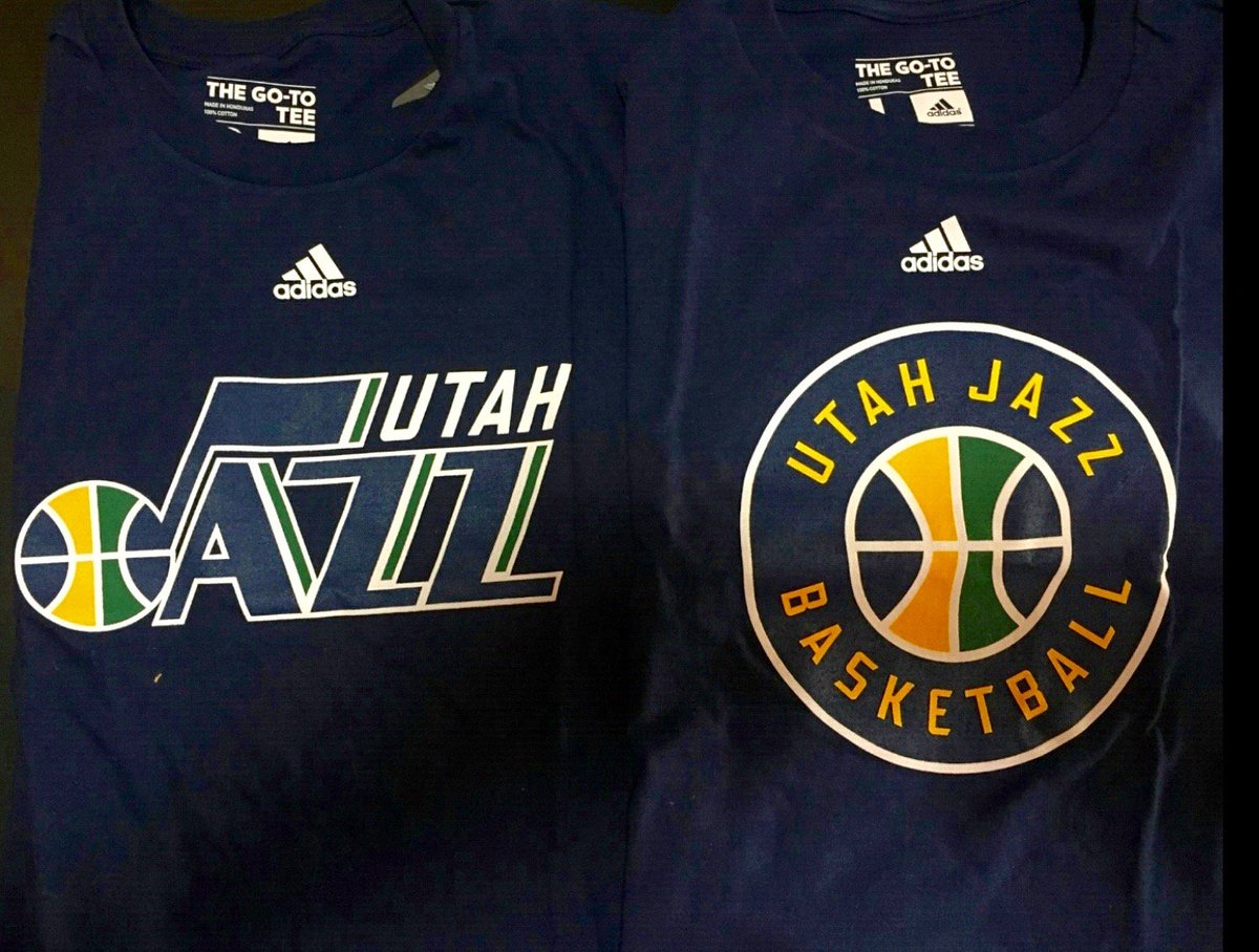
TBH I am glad that they got rid of the mountains. It all matches and works together now so that is a plus. As far as the look of the 2nd logo by itself, meh.
 
I figured it would be a minor rework to the Jazz note and making it the primary.

The secondary logo is total *** though.
 
I figured it would be a minor rework to the Jazz note and making it the primary.

The secondary logo is total *** though.

Touche. The minorly reworked primary logo looks nice. But the secondary logo is completely uninspired.
 
Should have gone green. I knew they wouldn't but still


RBaXwfR.png
 
Willing to bet they update the court to include the secondary logo as our new center court logo, ala the old Salt Palace court.

11583646906_e43db41925_z (1).jpg
 
I wish they never would have done this. I like the Note better without UTAH. They should have just left the note as the secondary logo and continued to use it anyway.
 
The one on the right could have been designed by a four year old.

CiMBSVaW0AAzGsV.jpg

honestly laughable. Did Gail just ask one of her grandkids to design it? I feel like designers across the country are cringing.
 
They could have done much, much better... They could have given the letters a more dynamic look at least, the current logo just seems a bit plain.

The current logo but in the following style would have been pretty sweet imo.


je6i81hlxtnzzdzhwnu02ra4l.gif
 
The 2nd logo looks like one of those drawings you can easily come up while attending a meeting you're not interested in... it literally hurts my eyes.
 
They could have done much, much better... They could have given the letters a more dynamic look at least, the current logo just seems a bit plain.

The current logo but in the following style would have been pretty sweet imo.


je6i81hlxtnzzdzhwnu02ra4l.gif

Don't take this the wrong way but...are you straight?
 
Top