What's new

Rebrand announcement coming next week

This nails it.

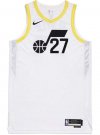
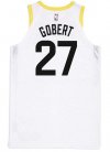
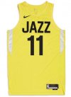
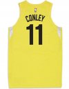
The jerseys are UNIVERSALLY hated. That doesn't happen in a healthy, functioning organization. That only happens when the decision is made by an echo chamber.

This is just like the Kings owner wanting to draft Stauskas and everybody around him submitting to the groupthink culture that he inspires.

Tech billionaires are seen to be visionary people who had the billion dollar idea and we’re able to execute. In reality, there was probably 50+ other companies the same as Qualtrics and Qualtrics was the one who made it out of the pack mostly by luck. Maybe it’s not as bad as a billionaire who simply inherited his wealth, but it gives these guys a god complex because everything that could have gone right for them did and they think it’s because of their magic touch.

On top of that…it’s just funny that Qualtrics is the company it is. It’s a survey company, but one that is designed to validate upper management.
 
This makes me think of when I went to get a new phone somewhere circa 2010. They were advertising a phone that was made from corn, so as to save the planet. Never mind the massive amount of plastic one consumes on a daily basis, you can feel good because a very small amount of plastic you buy every couple years being replaced in-part by corn. It's only a matter of time before the branding messaging on the simplicity of these designs plays up how this helps address climate change or is contributing to end white supremacy.
 
Look the theme seems to be "these jerseys are ****** but we kinda stuck with them for now" It is kind of how this team is gonna be.

I love this came out before Ryan's love letter to himself at AS game. He gonna look so dumb... even if he wears all the bracelets.
 
Look the theme seems to be "these jerseys are ****** but we kinda stuck with them for now" It is kind of how this team is gonna be.

I love this came out before Ryan's love letter to himself at AS game. He gonna look so dumb... even if he wears all the bracelets.

Yeah.. they should have made sure they didn’t suck before they came out with them and are now stuck with them for awhile.
 
Look the theme seems to be "these jerseys are ****** but we kinda stuck with them for now" It is kind of how this team is gonna be.

I love this came out before Ryan's love letter to himself at AS game. He gonna look so dumb... even if he wears all the bracelets.
Didn't you watch the promo video? It said forever.
 
This is the move that's making Wade want out.
 
FB_IMG_1655493918552.jpg
FB_IMG_1655493928215.jpg
You know what would've made this jersey pop off? If you used the purple mountain lettering with black and white. Boom. Maybe add black and white style mountains to the background, then use black white, yellow for the collar.
 
Yeah.. they should have made sure they didn’t suck before they came out with them and are now stuck with them for awhile.
Just feels like early you could have marched this out to 100 jazz fans... gave them free Jazz tickets for an hour of their time... ran the concepts passed them... and you would have buried the idea forever. It saves millions of dollars and more important... saves us from looking like complete jackasses.

They gonna be 50% off by the end of the day.

Especially if they are a one year thing lmao.
 
And as bad as the yellow, black and white are, could have been worse with only black and white. I don’t want the team colors to be like the Nets and Spurs. Their colors are ugly as f. That’s one of the best things about the Jazz, the Mardi gras colors.
 
I got the email. It's real. And it really sucks.
 
At this rate, Ryan should have just changed the team mascot and sold Jazz back to New Orleans.

If you're going to make a bold, unpopular move, don't do it half ***.
 
A purple blue gradient could have been done beautifully and would have been very popular.
I can not overstate how repugnant I find the yellow, black and white jerseys. Really, really awful.
Purple, blue, black, and white would've been so sexy.

Baby blue done right can be amazing. Like the Nets cloud throwback they did the previous year
 
Back
Top