
You are using an out of date browser. It may not display this or other websites correctly.
You should upgrade or use an alternative browser.
You should upgrade or use an alternative browser.
Jazz need new jerseys
- Thread starter Hotdog
- Start date
UGLI baby
Well-Known Member
I still like these ones.

I think we can all agree these were pretty bad, but I'd still like to see them one night a year for retro.
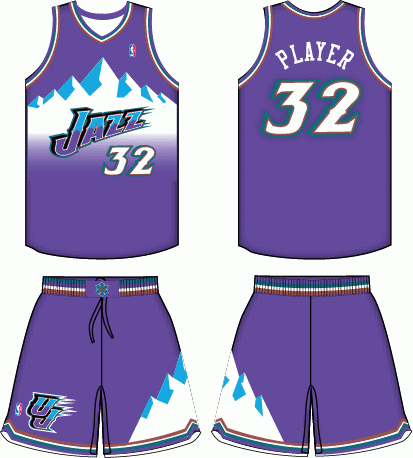
I think it's the memories associated with those that I like.
Kind of boring, but still better than what we have today.

There is no way that you are serious right now.
GVC
Well-Known Member
14 teams wear a shade of blue as the primary color on their away jerseys.
3 teams wear a shade of purple as the primary color on their away jerseys.
2 teams wear a shade of green as the primary color on their away jerseys.
The current set is a huge improvement on the blue-on-blue nightmare, but I'd love it if the Jazz tried to find a unique identity like they had before the switch to blue (the purple, turquoise and copper color scheme could even be revisited).
Hotdog
Well-Known Member
Holy **** this thread is an embarrassment.
We have some of the best jerseys in the NBA, hands down.
LOL @ Hack having the worst taste on planet earth. Every jersey you posted is pure garbage bro.
Your taste sucks..
Those jerseys we have ****ing terrible
What would you have the Jazz wear off the court? Skinny jeans? Pffftt.
Hotdog
Well-Known Member
**** anybody who wants to have a Jazz jersey without the Jazz Note on it.
One of the best logo's in sports.
I seriously would like to fight some of you right now.
The Jazz note is great. I agree. But our jerseys still suck.
fishonjazz
Well-Known Member
Contributor
2018 Award Winner
2019 Award Winner
20-21 Award Winner
2022 Award Winner
2023 Award Winner
2024 Award Winner
2025 Award Winner
Holy **** this thread is an embarrassment.
We have some of the best jerseys in the NBA, hands down.
LOL @ Hack having the worst taste on planet earth. Every jersey you posted is pure garbage bro.
This!!!!!!!!!!!!
I love all three (green, blue, white)
The current jerseys are the best we have ever had and probably the best in the nba
D
Deleted member 848
Guest
Holy **** this thread is an embarrassment.
We have some of the best jerseys in the NBA, hands down.
LOL @ Hack having the worst taste on planet earth. Every jersey you posted is pure garbage bro.
Loving Hack following his anti-skinny jean campaign with this nightmare of a thread. No wonder the dude is always in hiding-- people probably rip on his fashion senselessly.
D
Deleted member 848
Guest
Your taste sucks..
Those jerseys we have ****ing terrible
What would you have the Jazz wear off the court? Skinny jeans? Pffftt.
l-m-a-o
D
Deleted member 848
Guest
Your taste sucks..
Those jerseys we have ****ing terrible
What would you have the Jazz wear off the court? Skinny jeans? Pffftt.
#Pray4Hack
#Srs
.
I say they replace the blue with black. Why they didn't do this in the first place.
Butt-****ing awful.
Hotdog
Well-Known Member
Loving Hack following his anti-skinny jean campaign with this nightmare of a thread. No wonder the dude is always in hiding-- people probably rip on his fashion senselessly.
****.... you are in hiding just as much as I am. No one has ever seen you in person either.
Hotdog
Well-Known Member
HCk speak s troof.
Geeensrocker
Even the mighty PKM agrees with me.
Hotdog
Well-Known Member
View attachment 2836
View attachment 2837
These two colors schemes are sick. Id take either one over our current garbage. And they have the note.
It doesn't even have to be black. These just the only different ones I found. I think these look good for black.
It probably helps a little to have attractive jerseys in order to attract free agents. Id like to hear a player survey on who has the best jerseys. Id bet anything that the Heat are a top vote getter. Mainly because of the black color scheme. And the Jazz would be a low vote getter.
Hotdog
Well-Known Member
These two
fishonjazz
Well-Known Member
Contributor
2018 Award Winner
2019 Award Winner
20-21 Award Winner
2022 Award Winner
2023 Award Winner
2024 Award Winner
2025 Award Winner
Biff
*confirmed
I personally have always been a bit iffy with the current uniforms. I've thought about this to an almost disturbing degree. The Jazz should explore using a bluer-violet color (somewhere between the 90's violet and the current navy) and GOLD (not ****ing YELLOW) with green as a secondary color. The format of the current jerseys is cool, but I think making primary road jerseys a blue/violet with gold side-panels and trimming in white and green would be pretty cool for the primary away jerseys.
I've never liked the home jerseys. I've always hated that the side-panels on the current home jerseys (navy) are much darker than the numbers (whatever that green is, where the numbers wash-out in a sense, it drives me nuts), and that italicized font on the top of the *** crack is just dumb. I am also generally not a fan of the main color of the logo on the jersey being different than the numbers, but it is especially glaring with a navy logo paired with the green numbers which just looks bad (the colors are too similar to be so prominent with so much proximity). If the side panels were gold, then that green looks much better (but the color of the logo should probably match the color of the numbers). Or you just do the numbers in that blue/violet. I think that actually would look pretty sharp.
For an alternate, you could simply revisit the 2010/New Orleans throwback and change a few things (the yellow to gold change, maybe do the formatting of the other jerseys, though the Adidas-style striping might be better to stick with).
I like the idea of a blue/violet as the primary color as I think it could look classy, distinct, and ties together the two main colors that the UTAH Jazz have utilized (blue and purple). Gold is almost untapped as an actual uniform/logo color and is almost always better looking than yellow (which obviously has ties to the current uniforms and the classics). Those two colors together bear some resemblance to the Lakers, but I think there's enough separation there in addition to having green have some presence in the mix. With those colors, the Jazz would incorporate colors from every era that the Jazz have existed with some minor twists.
I don't disagree with Hack's premise that this jersey-era has been something of an unmitigated disaster, so... maybe the idea has a little merit from that perspective.
Last edited: