
Thanks A-Train.. good effort... but I think Bluenote has won this.. still not a big fan of the font, but I do like it over all the others by a good margin... (including my own).
You are using an out of date browser. It may not display this or other websites correctly.
You should upgrade or use an alternative browser.
You should upgrade or use an alternative browser.
JazzFanz.com Logo
- Thread starter Jason
- Start date
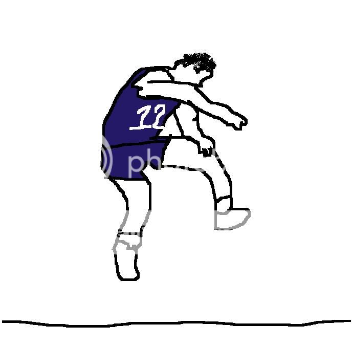
Just trying out some new ideas, what do you think with Salt Lake City in the back:

I've lived here (SLC) my whole life and I wouldn't know that's the skyline in the background. I like the idea and the effort, but it's not unique enough.
A-Train (old)
Well-Known Member
Thanks A-Train.. good effort... but I think Bluenote has won this.. still not a big fan of the font, but I do like it over all the others by a good margin... (including my own).
I agree, lol.
scootsy
Well-Known Member
lol made this for fun.

this is a gif that only runs once. by the time you scrolled down here, you wouldn't see the animation, so i made a looping version.
edit: looping solved.

Last edited:

I need to ask should this one win, where did the Malone picture come from? Did you make it from scratch or "borrow" it from an Internet friend?
scootsy
Well-Known Member
it looks like a modified a version of this photo:

which can be found in several places on the internet, including, https://www.utahjazz360.com/danhansen/top-10-best-dunkers-in-jazz-history/ and https://www.geocities.ws/NBA_Superstars2002/Dunks/karl_malone_dunk.htm leading me to believe you won't get too many complaints for using it.
which can be found in several places on the internet, including, https://www.utahjazz360.com/danhansen/top-10-best-dunkers-in-jazz-history/ and https://www.geocities.ws/NBA_Superstars2002/Dunks/karl_malone_dunk.htm leading me to believe you won't get too many complaints for using it.
scootsy
Well-Known Member
Yes, but did he make it from that, which I think is fair game, or did someone else do that work and he took it from them?")
agreed. although, even if he did take it from someone else, we could easily recreate a version of it! although, that silhouette was superbly done. it would take me several hours to do something similar. bluenote did a rockin job
bluenote's ftw.
Yes, but did he make it from that, which I think is fair game, or did someone else do that work and he took it from them?
Hey guys. So I made, then modified the silhouette from the photo image that scootsy posted. So the drawing of that photo was 100% mine. I was originally inspired by the Puma logo, wanted something classic Jazz, liked the idea of the logo letting you know it was a basketball site right off, and came up with the concept. Let me know if you have any more questions or want any modifications done. Had a good time making it and was happy with the final version.
Hey guys. So I made, then modified the silhouette from the photo image that scootsy posted. So the drawing of that photo was 100% mine. I was originally inspired by the Puma logo, then liked the idea of the logo letting you know it was a basketball site right off, and came up with the concept. Let me know if you have any more questions or want any modifications done. Had a good time making it and was happy with the final version.
Well done bro, very good work.
scootsy
Well-Known Member
Hey guys. So I made, then modified the silhouette from the photo image that scootsy posted. So the drawing of that photo was 100% mine. I was originally inspired by the Puma logo, wanted something classic Jazz, liked the idea of the logo letting you know it was a basketball site right off, and came up with the concept. Let me know if you have any more questions or want any modifications done. Had a good time making it and was happy with the final version.
can you give me your step by step guide to creating it? I keep trying but end up with a feathery halo effect.
How do you get the firm solid edges?
can you give me your step by step guide to creating it? I keep trying but end up with a feathery halo effect.
How do you get the firm solid edges?
Hey Scootsy, I'm at work and will let you know later this evening.
can you give me your step by step guide to creating it? I keep trying but end up with a feathery halo effect.
How do you get the firm solid edges?
So I used the magnetic lasso tool to trim out the image. It didn't do a perfect job so I had to go back to the silhouette later and redraw some of the missing Malone bits. Once the photo was trimmed I adjusted the output levels to make the image all black. Image>Adjustments>Levels>drug the Output Level from balanced to all black. Then I redrew some of the image to make it look a little better with a black brush - this took the most time. Finally, I used the paintbucket tool and filled in the entire image to make it all Jazz blue.
If it gets picked, I may take it into illustrator, trace it and make it a vector file so it's higher quality. If you zoom in now it's get's pixelated, but maybe the logo is big enough for the site that it doesn't matter. I like using photoshop but never taught myself how to balance quality, image size, etc.
Anyway, I'm pretty sure that's what I did. Are you learning photoshop for fun, or do you use it for work as well?
Last edited:
scootsy
Well-Known Member
So I used the magnetic lasso tool to trim out the image. It didn't do a perfect job so I had to go back to the silhouette later and redraw some of the missing Malone bits. Once the photo was trimmed I adjusted the output levels to make the image all black. Image>Adjustments>Levels>drug the Output Level from balanced to all black. Then I redrew some of the image to make it look a little better with a black brush - this took the most time. Finally, I used the paintbucket tool and filled in the entire image to make it all Jazz blue.
If it gets picked, I may take it into illustrator, trace it and make it a vector file so it's higher quality. If you zoom in now it's get's pixelated, but maybe the logo is big enough for the site that it doesn't matter. I like using photoshop but never taught myself how to balance quality, image size, etc.
Anyway, I'm pretty sure that's what I did. Are you learning photoshop for fun, or do you use it for work as well?
just as a hobbyist. i mostly like to make goofy gifs, but i do think it's fun to design concert flyers or website banners. most of the things i do are meant to be silly or hack jobs, so i have never learned how to do anything with your level of fine precision. hats off, i'm going to enjoy looking at that banner for the next 3-4 years.
just as a hobbyist. i mostly like to make goofy gifs, but i do think it's fun to design concert flyers or website banners. most of the things i do are meant to be silly or hack jobs, so i have never learned how to do anything with your level of fine precision. hats off, i'm going to enjoy looking at that banner for the next 3-4 years.
yeah, it's a fun program - I will have to try making gifs. Do you use flash for that? Also, I don't know if you have ever gotten into making shadows, but the instructions I gave is how you do it. Make a solid black silhouette of the image, give it some transparency/opacity, then free transform it and bend it along the ground plane until it looks right. Gives your images a lot more depth. Anyway, I'll stop there. How bout that DL eh?

The thought crossed my mind to add stockton but I didnt want it to be too busy. Then I wondered if it could rotate between malone and stockton or even sloan, pistol, Easton, hornacek, etc. when you opened the site. Meaning, when you reload the page it would be someone different, or maybe it would switch monthly. Then that seemed like a lot of work. I'll give it a shot with Stockton and post it tonight.