What's new

Whaddya think of these tweaks to the Jazz jerseys??

They just recolored the Thunder uniforms. The design is generic, boring, bland. Colors are fine, but the unis are ****.

3275_oklahoma_city_thunder-home-2011.gif

bta2b0p83cuqgvrynkqvub3mr.gif

On sports jerseys, I'm always going to go with a clean, basic look that is matched up with a good color scheme. Utah has that going for them. It's all too easy to try and do too much with a jersey/logo and have it come out looking like a circus act. Less is more IMO.
 
On sports jerseys, I'm always going to go with a clean, basic look that is matched up with a good color scheme. Utah has that going for them. It's all too easy to try and do too much with a jersey/logo and have it come out looking like a circus act. Less is more IMO.

Clean basic looks work for classic teams, like the Celtics and Lakers. I don't think 30 teams can pull that off though without it becoming redundant and boring.
 
Clean basic looks work for classic teams, like the Celtics and Lakers. I don't think 30 teams can pull that off though without it becoming redundant and boring.

To each their own as it certainly is a subjective issue. However, I feel like that line of thinking is why we got uniform abominations such as the 90's Supersonics and Pistons. Hell, even the Jazz mountain logo was clown shoes.

If simple and clean with a poppin' color scheme is boring, sign me up.
 
On sports jerseys, I'm always going to go with a clean, basic look that is matched up with a good color scheme. Utah has that going for them. It's all too easy to try and do too much with a jersey/logo and have it come out looking like a circus act. Less is more IMO.
Plenty of basic, original designs in the NBA. I'm not sure where I advocated for garish nightmare uniforms. Again, the Jazz just recolored OKC's jerseys. Completely uninspired.
 
The green and purple does not work. At all.

I far prefer the green alt ones we have now.

The white and purple ones are nice but I'd change some things like the angle and size of the names.
 
To each their own as it certainly is a subjective issue. However, I feel like that line of thinking is why we got uniform abominations such as the 90's Supersonics and Pistons. Hell, even the Jazz mountain logo was clown shoes.

If simple and clean with a poppin' color scheme is boring, sign me up.

LMAO those where all great jerseys.

What's your opinion on Atlanta's jerseys? Does that fit "simple and clean with poppin' color scheme"? I really like those jerseys but I wouldn't consider them to be simple and clean. They aren't 90's cartoon designs, but by modern NBA standards they are pretty out there.

You aren't really going to see anything fun or interesting anymore like what we got in the 90's, which is sad.

I'm "meh" on Atlanta's. As far as the rest of the debate, if you really think that the 90's Sonics and Piston jerseys were "great", there's no need for us to discuss the matter any further. We're on complete opposite ends of the spectrum.
 
To each their own as it certainly is a subjective issue. However, I feel like that line of thinking is why we got uniform abominations such as the 90's Supersonics and Pistons. Hell, even the Jazz mountain logo was clown shoes.

If simple and clean with a poppin' color scheme is boring, sign me up.
Sorry but 90s Sonics and Pistons are some of my most favorite designs ever. They were innovative, fun and just straight up cool. Loved the color combos.


We hardly get those cool logos anymore all we get now are just so boring and unimaginative.
 
not really understanding the hate on the purple.. Id much rather have purple be the 3rd color than blue.
 
not really understanding the hate on the purple.. Id much rather have purple be the 3rd color than blue.

agreed. Navy is the most boring color in the history of uniforms. Any uniform. But a lot of fans have boring style, so they'll stick with it.
 
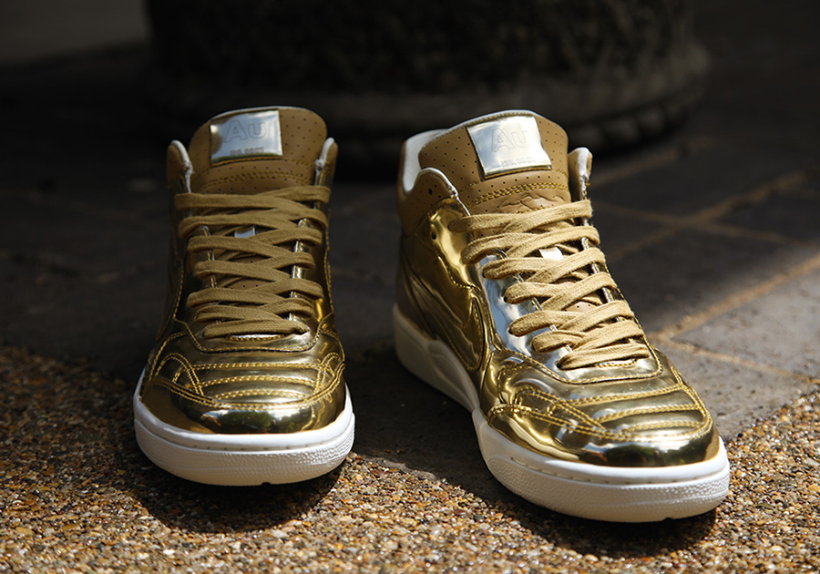
I wish the JAZZ would work with NIKE and the players to do a team shoe. Shiny *** gold with a gold note on the back for away white with the blue green and gold note for home.
 
I wish the JAZZ would work with NIKE and the players to do a team shoe. Shiny *** gold with a gold note on the back for away white with the blue green and gold note for home.

Unfortunately not all the players are sponsored by Nike, so that will only work for certain players.
 
Top